Landing pages are designed to convert leads into sales. They’re different from a sales page or a homepage; typically, they’re used to drive search engine traffic to your website and lead people to perform an action like subscribe to a newsletter or learn more about your products.
It’s likely you have several landing pages all across your website, but they might not be reaching their full potential. In this guide, I’m going to outline how you can optimize your landing pages to make them as effective as possible. Let’s dive in!
Target the best possible keywords with your copy
At this point in your marketing journey, you’re likely familiar with keyword research and search engine optimization (SEO). With keyword research, you can help ensure you’re ranking for the right searches so the right people are sent your way. This is what will help lead to more sales.
If you don’t target keywords appropriately on your landing pages, you could end up with a lot of traffic, but not a lot of conversions. Or, if your targeting is weak, irrelevant, or doesn’t show people exactly what they’re looking for, your leads will be disappointed and have a poor experience.
There’s a huge variety of paid and free tools that can help you pick your keywords, and Google Keyword Planner is a great place to start. Start by creating a list of general but relevant topics that you can plug into the keyword planner. They’ll provide you with different keyword ideas as well as their level of competition and number of monthly searches. You might want to target low-competition keywords that ensure you’re at the top of the search engine results pages (SERPs) for that keyword rather than trying to rank for a highly competitive keyword. It’s all about finding the right balance between search volumes and competitiveness.
Ensure your copy is engaging and focuses on benefits, not features
Your landing page copy can make or break a sale! Make sure it’s engaging, informative, and focuses on the benefits your products or services can bring to your customers.
There are lots of ways you can help ensure your copy is effective, but you can start by staying true to your brand voice. Consider whether your copy should be technical, conversational, or humorous. Let’s take a look at some examples of effective landing page copy that focuses on the benefits of a product.
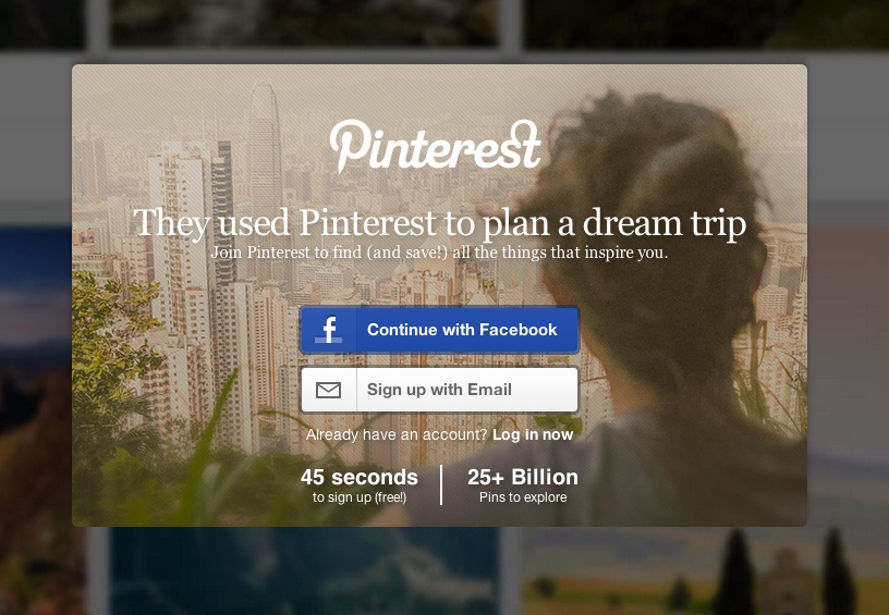
When you think of Pinterest, you probably think of outfit inspiration, event planning, vacation must-sees, and more. Their landing page copy is straightforward and gets the reader to start imagining their next dream trip. The copy states the benefit that they offer a short, easy, sign-up process that will lead to over 25 BILLION potential ideas from their pins.
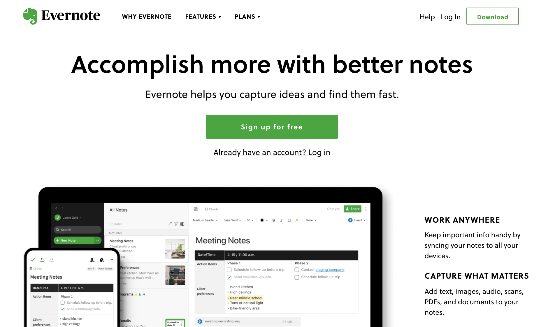
Evernote focuses on the benefits of their product in their landing page copy, as well. They outline how their product can help someone manage their notes in the modern world. It’s not good enough to just take notes; you need great notes, and Evernote can help with their cloud syncing, easy access, and more. Their message is simple and apparent right off the bat: with Evernote, you can accomplish more.
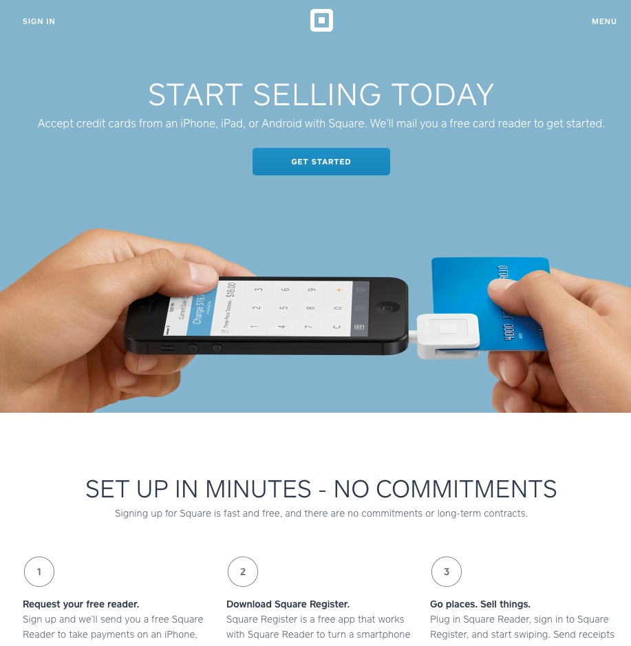
Square also has great landing page copy. Immediately upon seeing this landing page, you know two things: first, they can help you sell more products. Second, their card reader is free. After reading further, you can learn more about just how easy it is to incorporate Square into the day-to-day running of your business.
Help visitors imagine themselves using your services
When designing your landing page, try to help prospective customers imagine themselves using your services, so you can push them to make a purchase. You can achieve this by using strong visuals, focusing on the benefits of your products rather than the features, and showcasing customer testimonials.
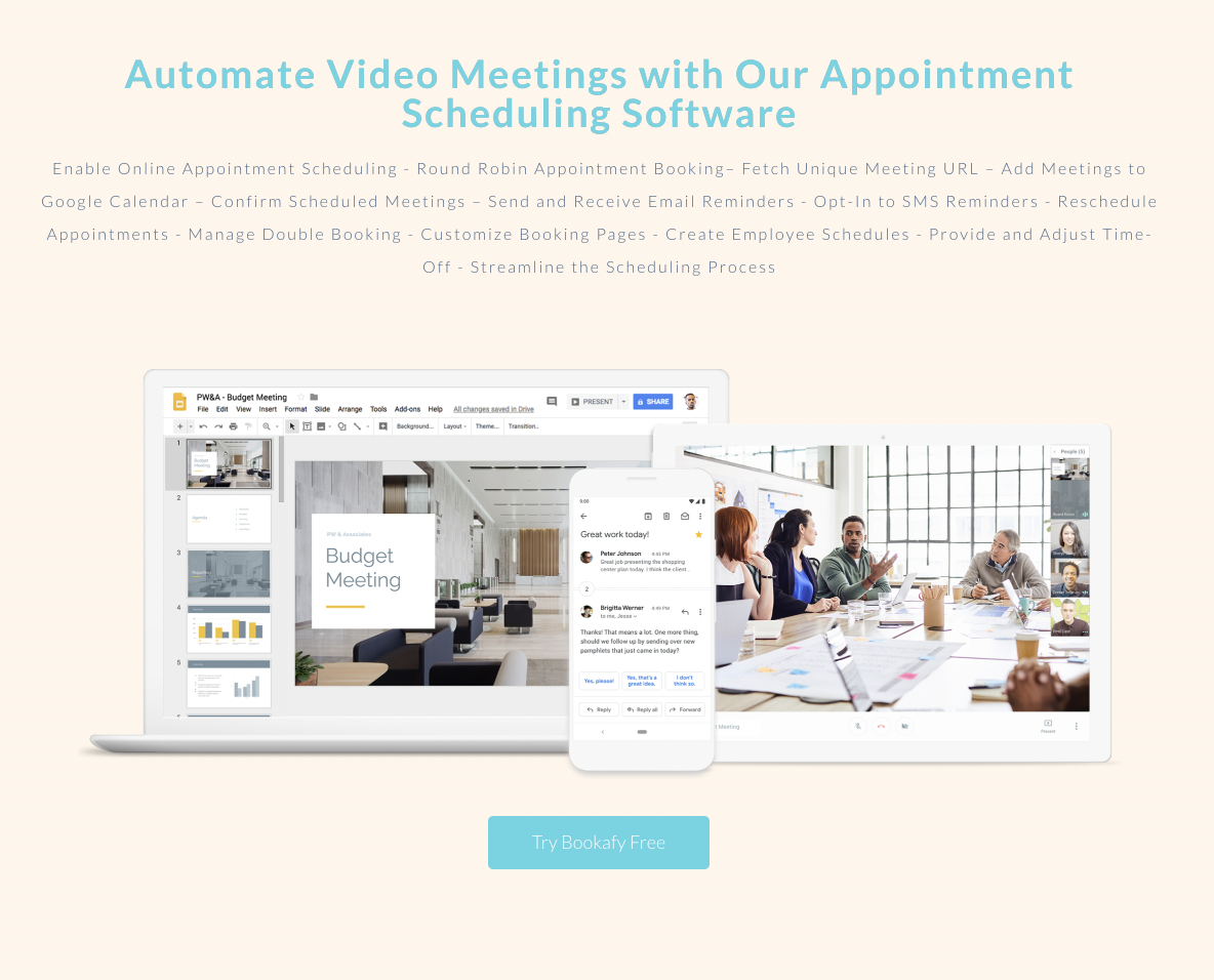
Take a look at how Bookafy does this on their appointment scheduling software landing page. They show how video meetings can be automated with their software with a visual example of how it works. The images and mock meeting examples let viewers envision themselves using their software.
Additionally, notice how their CTA shows a huge benefit — you can try the service for free.
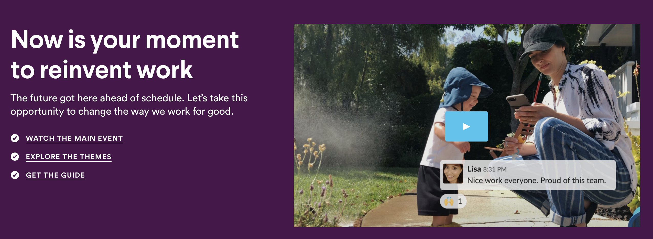
Similarly, Slack, a workplace messaging tool, does this well on their product landing page. In their image, they have a mom, Lisa, and her child playing outside together. Lisa shoots out a quick message to her team commending them for their work, and this shows how Slack can help with developing a good work-life balance.
The phrase “now is your moment” lets viewers think about how they can rise to the challenge of making their workplace better than ever before. Who wouldn’t want to be a part of this movement?
Always put your call-to-action front and center
Your CTA is probably the most important part of any landing page you put together. It tells your visitor what they should be doing next! You can make yours effective by ensuring they stand out, putting them above the fold, and making sure there aren’t any distractions around them.
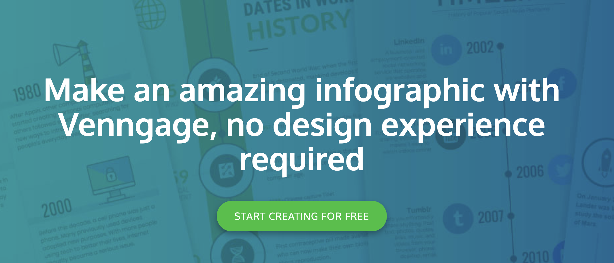
Take a look at how Venngage does this effectively on the landing page for their infographic maker. Their CTA stands out in a different color and is above the fold. Just below their header copy, you’re told to start creating these amazing infographics for free.
The design is pleasing, the CTA stands out, and it’s clear to the viewer what they should be doing next.
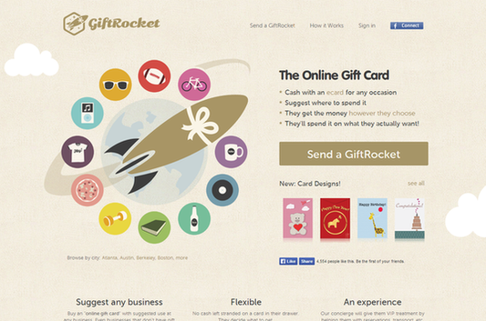
GiftRocket does this well, too. Let’s face it, gift cards offer one of the easiest ways to show you care. Their simple CTA, “Send a GiftRocket,” implies how quick and easy it is to send an online gift using their product.
The difference with GiftRocket is that the recipient can choose their gift card; with a short explanation and CTA combo, the reader can be convinced to pull out their wallet
Create a sense of urgency or FOMO
Ever heard of the fear of missing out? If people are worried that they’re one of the only people not taking advantage of a purchase, this can be a very convincing marketing strategy!
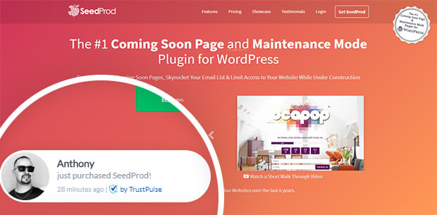
There are plenty of ways you can create a sense of FOMO with your landing pages. SeedProd, for instance, shows in real time who is making purchases on their website. By showing the name and location, it’s clear that it’s a real person. If people know that others are getting in on the action, they’ll want to make a purchase, too!
You can also infuse a sense of urgency into your web pages with timed sales, limited stock announcements, by highlighting a sold-out product, and more.
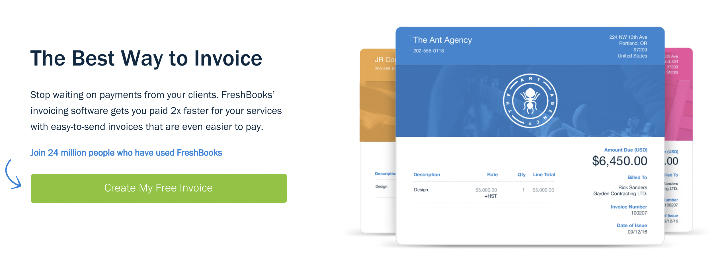
Take a look at how FreshBooks, an online accounting software program, inspires FOMO with its free invoice template landing page. The company highlights that 24 million people are already using FreshBooks’ free tools, so don’t you want to be the next in line? This is FOMO marketing in action.
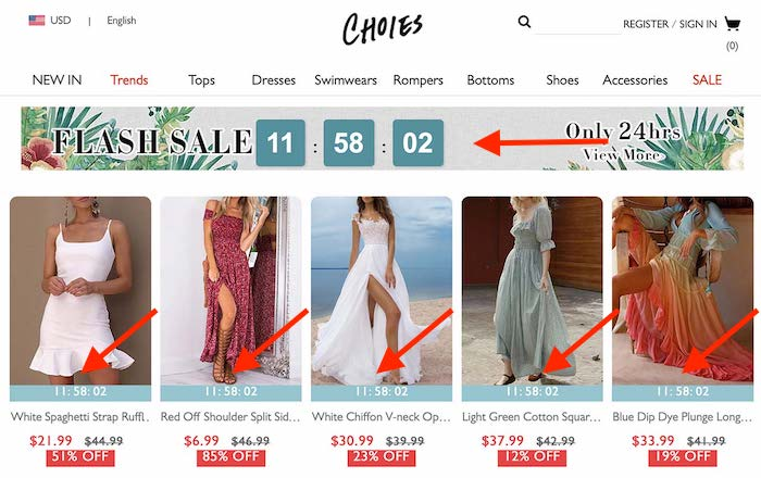
Or, take a look at how Choies, a fashion retailer, incorporates a feeling of FOMO into their landing page and sale section. Upon viewing, visitors know that they only have a limited amount of time to get in on the sale before the deadline. With this in mind, customers will be far more likely to make a purchase there and then.
Provide social proof with testimonials and reviews
Above anything else, people tend to trust word-of-mouth recommendations when considering whether to make a purchase. So, it’s worth adding reviews and testimonials to your landing pages to convince your audience that your product or service is worth investing in.
You can collect testimonials and reviews from Google, through your product pages or customer service team, or even just by asking customers what they liked about your products. Add them to your landing page in a way that will catch your customers’ eyes; consider adding them to the hero image or near your CTA.
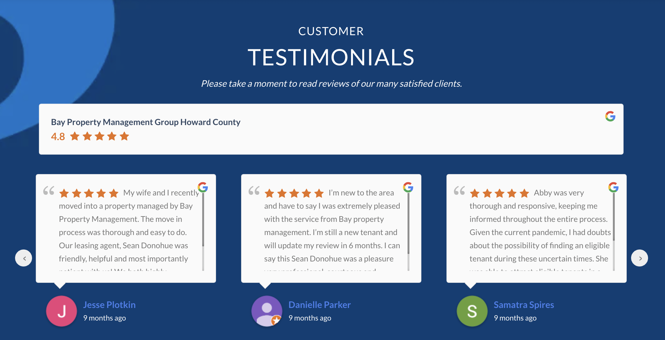
Bay Property Management Group, a real estate company, does this well on its local landing pages. Scrolling down towards the bottom of these pages, you see a series of Google reviews with the time they were posted. This helps optimize your landing page because it provides evidence that people have enjoyed using your services. Many of their reviews call out different employees, as well — this helps humanize the people on their attached “About the Team” page and earn a viewer’s trust.
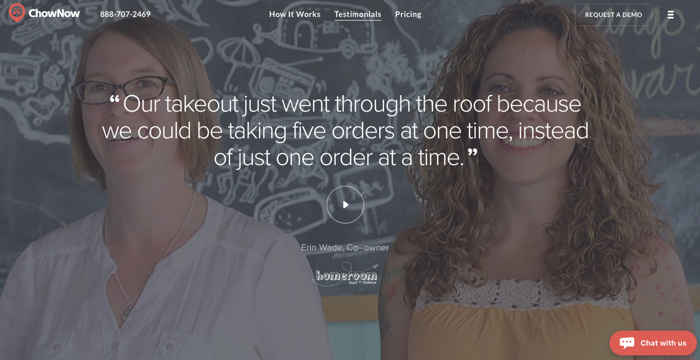
Or, consider how ChowNow showcases customer testimonials on their landing pages. The simple design makes the reviews the star of the show! Not only is there a quote that shows how the company’s products have helped customers, but the attached video humanizes the service and taps into a viewer’s sense of FOMO.
As ChowNow shows, there’s more than one way to incorporate reviews and testimonials into your landing pages. Consider what would be best for your product, be it a carousel of reviews, a personalized testimonial video, or a simple quote from a customer survey. If you have a lot of Google reviews, a carousel would be a good starting point because you already have the content!
Ensure your landing pages offer a positive UX
If your landing page offers a poor user experience (UX), people won’t hang around long enough to make a purchase.
There are a ton of factors that contribute to the UX of a landing page. The longer your page takes to load, for instance, the less likely your customer will make a purchase. 1 in 4 visitors will abandon a webpage that takes longer than 4 seconds to load, so you should run a site test and improve your loading speed if necessary. Google’s PageSpeed Insights can help you conduct a website speed test and provide you with information on how to improve your speed.
Make sure your website is easy to navigate, too. All of your menu elements should have clickable links; look at your links from time to time to make sure they’re still working. You can also provide a positive navigation experience by ensuring your website’s search feature works and provides the viewer with accurate, helpful information. It could help to ask a friend, family member, or even a customer how their navigation experience was after visiting your site.
It is also vital that your website works well on every browser and type of device. Make sure your page is optimized for iPhones, Androids, laptops, and desktops. As of February 2021, about 56% of web traffic comes from a mobile device so, if a user can’t easily see your information or navigate your website on their phone, they won’t be likely to make a purchase with you. When building your website, make sure you equally prioritize the mobile version!
Summary
In this article, I’ve outlined a huge variety of ways you can optimize your landing pages, but keep in mind that you don’t have to use all of them! Some will work better for your business than others.
Consider focusing on providing an optimized UX, customer testimonials, engaging and informative copy, and a sense of FOMO when putting together your landing pages. And don’t forget to include a clear and engaging CTA!
It’s now time to roll up your sleeves and get to work. Take a look at your website and see what you can optimize!
Adam Steele is COO and co-founder of Loganix, which is an SEO fulfillment partner for digital marketing agencies and professionals. The company provides the SEO services that businesses need to grow and achieve their goals. If you enjoyed this article, you can find more SEO guides and templates on the Loganix blog.

")
")


