As you know, Layout Builder is one of the excellent features of Helix Ultimate. It allows you to customize your Joomla template in almost any shape without code customization. You can easily build flexible layout based on module positions.
1. Layout Grid
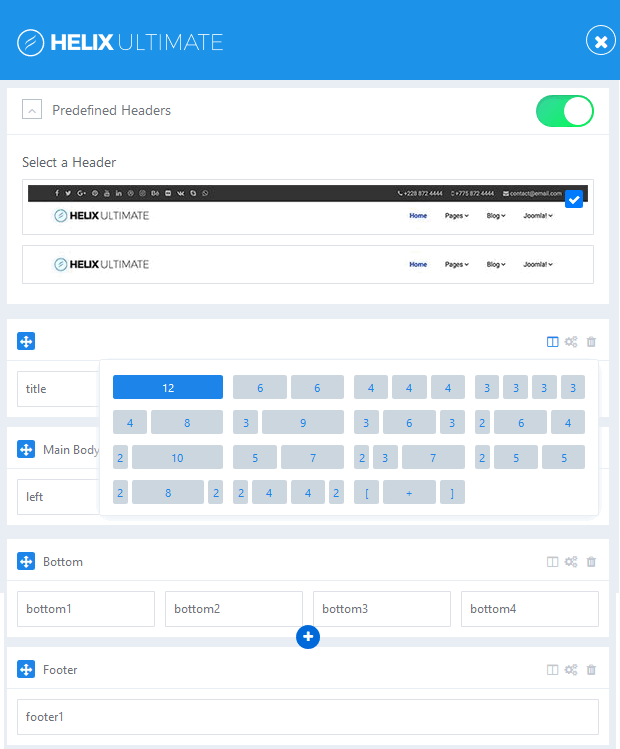
Helix Ultimate Layout is based on 12 column layout from Bootstrap 4. It comes with a powerful mobile-first flexbox grid system. You can choose columns pre-set or set your own grid easily.
The grid system is responsive, so the columns will automatically be rearranged to display beautifully on all devices and screen sizes.
Helix Ultimate has 2 built-in header variations to enrich the scope and versatility of your sites created with the framework.
Each Row can have its own column structure and unique settings.
To add new Row, click the plus icon (+), choose column structure and select module position(s). You should choose a short ID for the new row.
Instructions for creating custom header:
As we mentioned above, there are two predefined Headers. However, you can create your own custom header variation. (To do it, you have to disable this option). Watch the video tutorial below:
Turn off the Predefined Headers option.
Create a new Row by clicking on the plus icon (+).
Grab new Row that you just created and move up above the “Page Title” row.
Click gears icon to get into row options.
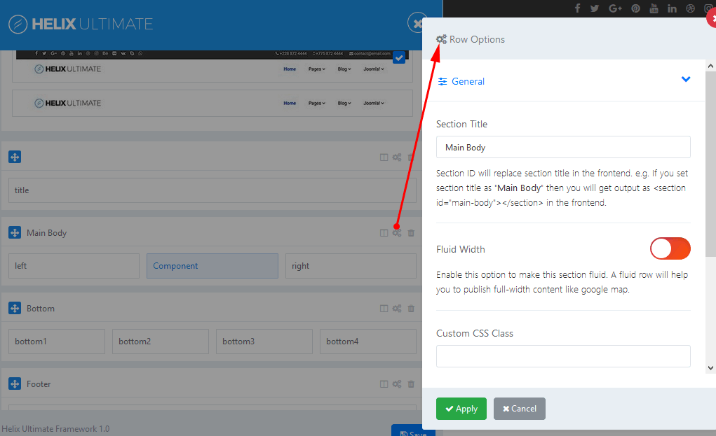
Add name inside the “Section Title” field: header
Set column icon by clicking columns icon.
Choose one of predefined Headers or from your own custom header.
Choose module poistion for each column.
Don’t forget to save changes.
Set responsive grid for each column.
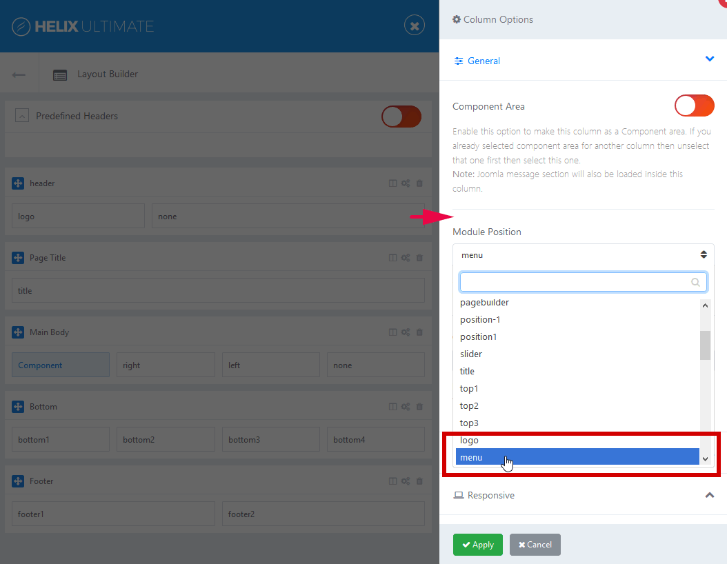
Note: Logo would be taken from Helix Basic settings, and Menu from Helix Mega Menu engine.
And you have choose different module position name, do not use “menu” if you want to use your own menu module.
2. Row Options
In Row options:
You can insert section title ( the section title should be short and have no extra languge native marks)
Fluid Width: Enable this option to make this section fluid. A fluid row will help you to publish full-width content like google map.
Add Custom CSS class
Define Row Style: margin, padding, text color, link color, link hover color, background color and choose background image.
Responsive settings – It allows you to hide Row on selected devices:
º Smartphone – screen width less than 576px
º Largen Smartphone – screen width equal to or greater than 576px
º Tablet – screen width equal to or greater than 768px
º Smaller Desktop – screen width equal to or greater than 992px
º Desktop – screen width equal to or greater than 1200px
3. Columns Options
Make Component Area: When you enbale this option, this colums would be as Component area. If you already selected component area for another column then unselect that one first then select this one. Only one column in whole layout can be used for showing component.
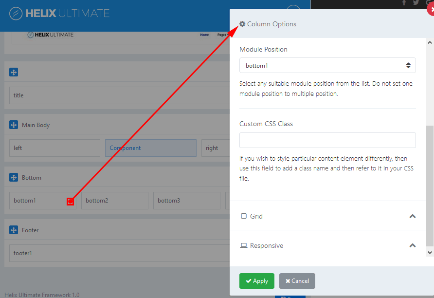
Module Position: You can select a suitable module position. Do not set this same module position to multiple position. List of module positions:
Above and below component area there are two module positions: content-top and content-bottom which you can use to publish any module.
Custom CSS Class – you can use this field to add a class name and refer to it in your CSS file.
Grid – you can control of responsive layout. There are five grid breakpoints, one for each responsive breakpoint.
Responsive option: it allows you to hide columns on selected devices
º Smartphone (screen width less than 576px)
º Largen Smartphone (screen width equal to or greater than 576px)
º Tablet (screen width equal to or greater than 768px)
º Smaller Desktop (screen width equal to or greater than 992px)
º Desktop (screen width equal to or greater than 1200px).
If you have any question about this tutorial, don’t hesitate to leave a comment below. And don’t forget to share with your friends if you find it useful! Thanks! 😀
We're Content Marketing team from AgeThemes with 10+ years in open source and tech. Our mission is to deliver high-quality content tailored for users of open source CMS platforms, including Joomla and WordPress. We strive to empower our audience with valuable insights and resources to enhance their digital experiences.
 Editor Team